

Even the world’s biggest brands, armed with massive budgets, superstar creative teams, and global name recognition, have stumbled. And when they stumble, the whole world notices.
Over the past decade, we’ve seen some jaw-dropping branding blunders: packaging changes that confused loyal fans, ads that sparked public outrage, and name changes that left customers scratching their heads.
These stories aren’t just gossip. They prove that great branding isn’t just about being clever; it’s about staying consistent, authentic, and connected to the people who love you.
Here are 10 of the most unforgettable branding mistakes of the past decade and what every business can learn from them.
1. Tropicana’s Packaging Redesign (2009–2010)
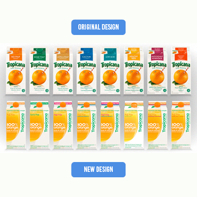
When Tropicana ditched its famous “straw-in-orange” image for a plain glass of juice, shoppers literally didn’t recognize it on shelves. Within two months, sales nosedived 20% and the old design came rushing back.
Lesson: Don’t throw away your visual equity. Logos, colors, and symbols can be as valuable as the product itself.
2. Pepsi’s Kendall Jenner Ad (2017)
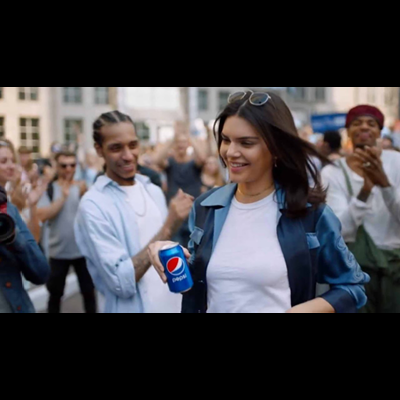
Pepsi tried to position its soda as a peacekeeper in an ad featuring Kendall Jenner. Instead, it trivialized real social justice issues. Backlash was so intense the ad was pulled in less than 24 hours.
Lesson: Authenticity matters. Social causes require real commitment, not opportunistic marketing.
3. Gap’s Logo Redesign (2010)
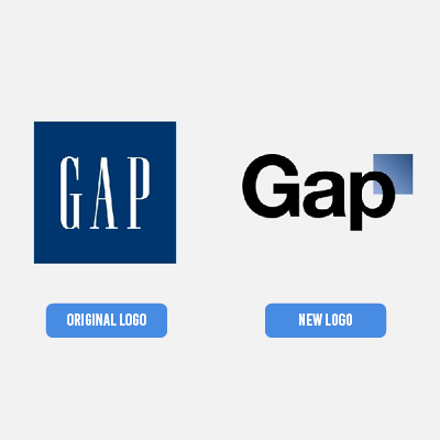
Gap swapped its iconic blue box for a “modern” design. Customers hated it. Within a week, Gap backtracked.
Lesson: Heritage brands should respect consumer attachment. Updating a logo is about more than design, it’s about identity and trust.
4. IHOP’s “IHOB” Stunt (2018)

IHOP shocked the world by rebranding as “IHOB” (International House of Burgers). It grabbed headlines but confused customers and diluted its breakfast-first identity.
Lesson: Buzz is great, but not at the expense of brand clarity.
5. Bud Light & Dylan Mulvaney (2023)

A small influencer collaboration snowballed into a polarizing cultural debate. Without a clear plan, Bud Light alienated both supporters and critics, sales tanked.
Lesson: Anticipate cultural flashpoints. Crisis-response planning is part of brand management.
6. Yahoo’s Identity Crisis (2010s)

Multiple rebrands, logo changes, and unfocused strategies left Yahoo without a clear position against Google or Facebook and it quietly faded into irrelevance.
Lesson: Consistency is power. Without a clear message, even big brands get lost.
7. Weight Watchers → WW (2018)

In a push to modernize, Weight Watchers shortened its name to “WW.” Customers found it vague and uninspiring. Brand recognition definitely dropped.
Lesson: Rebrands need clarity. Abbreviations and generic terms rarely carry the same emotional weight as a strong name.
8. Burberry’s Beige Logo (2018)

Burberry ditched its iconic equestrian knight emblem for a stripped-down beige wordmark. Critics said the change erased heritage and made the luxury label feel interchangeable.
Lesson: Luxury thrives on heritage storytelling. Minimalism can work, but not at the cost of history.
9. J.C. Penney’s “Everyday Low Prices” (2011–2013)

The retailer killed coupons in favor of “everyday low prices.” Shoppers who loved hunting for deals walked away. Sales dropped 25% in a year.
Lesson: Understand what customers value before changing your promise. What feels modern may erase what makes you special.
10. Cracker Barrel’s Quiet Test Rebrand (2025)
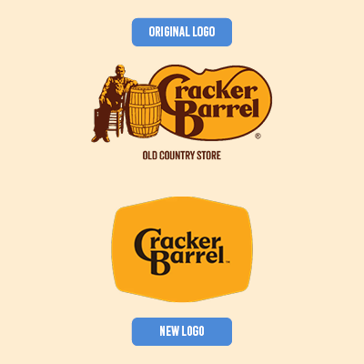
Cracker Barrel tested a name change to “Cracker Barrel Kitchen.” Loyal customers revolted, arguing nostalgia and tradition were the heart of the brand.
Lesson: Legacy brands should evolve with care. Modernization should enhance heritage, not erase it.
The Big Picture: What These Fails Teach Us
Across these high-profile missteps, four themes keep popping up:
- Heritage matters. Customers form deep emotional bonds with logos, names, and symbols. Change them carefully.
- Authenticity is non-negotiable. Tone-deaf campaigns and shallow social messaging almost always backfire.
- Clarity beats confusion. A rebrand should make a company easier to understand, not harder.
- Know your customers. Ignore your audience’s values, and you risk alienation and irrelevance.
Key Lesson for Every Brand
Branding is about more than a logo, ad campaign, or packaging. It’s about trust, memory, and emotion. When brands misstep, the consequences can be swift and severe but the lessons are priceless.
Whether you’re a startup or a household name, the takeaway is the same: stay authentic, honor your identity, and keep your customers at the heart of every decision.