
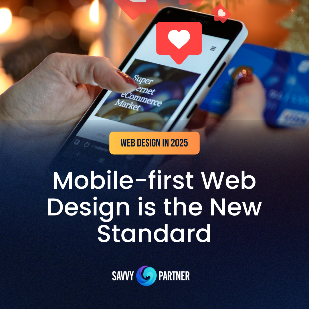
In just a decade, internet use has shifted to mobile. For many, a phone is the only connection to the digital world. Businesses can’t afford to treat mobile design as an afterthought, mobile-first is no longer a trend, it’s the standard for creating meaningful digital experiences.
What Mobile-First Really Means
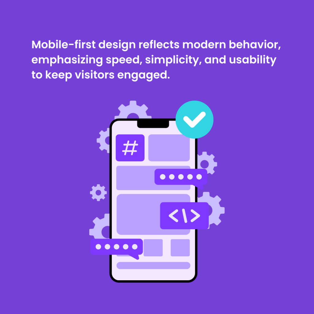
At its core, mobile-first design means building a website with the smallest screen in mind, then scaling upward to tablets and desktops. Instead of cramming a desktop experience into a tiny device, this approach forces clarity. Mobile-first reflects modern behavior—where speed, simplicity, and usability define whether a visitor stays or bounces.
Why It Matters for Business
A mobile-first design is a growth strategy because a mobile-first website isn’t just about aesthetics, it’s about outcomes.
- User experience: A streamlined, touch-friendly site makes it easy for customers to navigate, explore, and buy.
- Search visibility: With leading search engine’s mobile-first indexing, your mobile experience directly impacts your rankings.
- Business results: Fast, intuitive websites increase conversions, build trust, and keep customers engaged longer.

Principles of Mobile-First Success
Winning with mobile-first requires discipline. It means:
- Prioritizing the most important content and eliminating clutter.
- Creating intuitive, simplified navigation.
- Optimizing for speed with lightweight code and compressed visuals.
- Designing for the way people actually use their thumbs—not a mouse.
These principles aren’t just design guidelines; they’re commitments to respecting your customer’s time and attention.

What’s Next
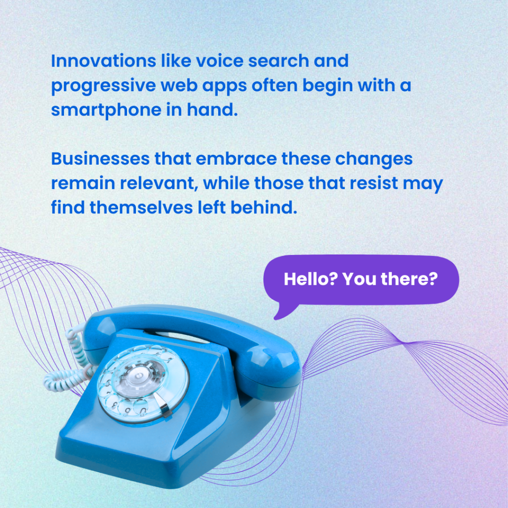
Mobile-first isn’t a future trend, it’s today’s reality, shaping how customers interact online. From voice search to progressive web apps, nearly every innovation starts with the phone in hand. Businesses that adapt stay relevant; those that don’t risk falling behind.
Mobile-First Web Design is Essential
Mobile-first web design is more than a technical choice, it’s a leadership decision. It reflects whether your business truly aligns with how customers live, work, and buy today. The question isn’t whether your site looks good on a phone. The question is whether your digital presence is designed to meet people where they are now: on mobile, first.

Does your website truly deliver a mobile-first experience that drives growth? Contact Savvy Partner today to learn more.